Lighting Engine
Lightening up your mood
Humans need light to survive, we crave it and it shapes us. It is so important that there is a disorder called seasonal depression disorder that is caused by a lack of light. Not only does light affect us through physical biology, it also affects us emotionally. Lighting can alter the state of our moods, energizing us or calming us down.
My lamp is for aiding personal relaxation. Personal relaxation is quite a broad topic, so I tried to get a better picture of what this action was by compiling photos.


A place of relaxation allows for people to be positioned comfortably and either perform a mindless task or do nothing at all. This lack of things to do steers the lighting in the direction of being softer and warmer. As opposed to a desk lamp, a personal relaxation lamp is not utilitarian. The purpose is purely emotional since the whole point of a relaxing place is to sooth the mind and soul.
It also seems that the lights are generally close to the person relaxing. Perhaps lighting from a distance is too impersonal, and in a space that is dedicated to a singular presence, distance is not suitable.
Warm light aids in relaxation because our bodies naturally become more awake in the presence of cool light. Cool light mimics the tone of natural daylight and alerts our minds to stay energized, whereas warm light mimics the warmth of a fire or the sunset. Historically, fires were used to provide light during the evening or night, which is closely related to winding down and preparing to sleep.

Basic guidelines for a personal relaxation lamp:
- soft, warm light
- not too complex
- close in proximity to the person
- portable (not a requirement but is a nice addition)
The last guideline: being portable is something that I think would add to the personable aspect of the lamp; however, I think that this is not high up on the priorities list because, anyways, the lamp will be anchored by the cable and outlet. If this were battery powered, I think the aspect of portability would make it convenient for moving the lamp to perhaps a bedside or a bathroom for relaxation purposes.
Then, I started by experimenting with different papers and how they behave under light. I used 5 different types of paper with varying weight: bristol, Neenah white cardstock, Neenah off-white cardstock, white cardstock from the art store, and printer paper.
The paper behaved in various ways that I had not expected. White paper gave away to purples, yellows, and reds when light was shined through it.


This is bristol paper. It gives off faint reddish brown hue when layered upon itself. I initially thought this would be a good paper to use when experimenting with only one layer; however, I’m not sure if the reddish color is the most ideal for relaxing. I think that the color is not too far off the mark since it is toned down and is warm, but I hope to find something less red since red is associated with other connotations like anger and love.


A yellow hue is given off from this paper. The paper has small flecks of other colors, which is not too noticeable. A single layer does not block enough light and causes the color to be more vibrant, so if I were to use this paper I would have to double up the layers to tone it down. However, I’m not sure if this speckled paper is allowed for the project, so I will ask Steve and Stacie.


This paper also gives off a yellow hue but more intensely than the previous cardstock. This one does not have small specks of color, but it is slightly off-white. Similarly to the previous cardstock, the paper does not block a lot of light and becomes quite vibrant.


This cardstock is from the art store. It strangely gives off a very deep purple color and shows a lot of the paper texture. I am slightly put off by the paper texture as it reminds me of skin for some reason. Since this paper makes me uncomfortable and the whole purpose of the lamp is to make someone comfortable, I will not be using it.


This is printer paper. It gives off the most true white tone, but it is also very thin. It appears to be on the neutral gray side which could be relaxing in the right context.
Overview of paper types:
- bristol paper — reddish brown hue, more opaque
- Neenah white cardstock — yellow hue, less opaque
- Neenah off-white cardstock — very yellow hue, less opaque
- Art store cardstock — purple hue, medium opaque
- Printer paper — white or gray hue, medium opaque
I’ve observed that a thin layer of most papers gives off a closer to white toned light, while adding on layers and thickness further distorts the color and shows more characteristics of the paper. I also observed that the color of the paper in photos is sometimes not true to the hue given off in real life. I’m not sure what causes my camera to alter the color, but I will try to figure it out so that the photo accurately portrays reality.
I can imagine the toned-down neutral tints being used in a zen style meditation room while the warmer colors being used in a home relaxing environment. Both are valid forms of personal relaxation, so I think the choice is dependent on the type of environment I envision the lamp to be in.
Moving forward:
- What type of “relaxing” environment is the lamp existing in?
- How does the tone of the light effect us?
Taking form
November 17, 2020
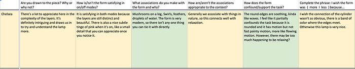
Steve and Stacie mentioned during class that we should explore our spaces more and describe them using adjectives and semantic differentials. They noted that this is crucial to designing an appropriate lamp for its designated task.
As I prepared to create sketch models for my light engine, I decided to fully explored my space. A vague idea of a relaxing room came to mind, but I wanted something more concrete to work off of. I looked up images of relaxing spaces and narrowed down what I envisioned.


The place I want to design a lighting engine for is a very cozy and personal space. Things are closer to the floor which makes it feel down-to-earth and not grandiose.
I then further described my place through words in my notes.

Keeping the environment of the lamp in mind, I started sketching ideas.
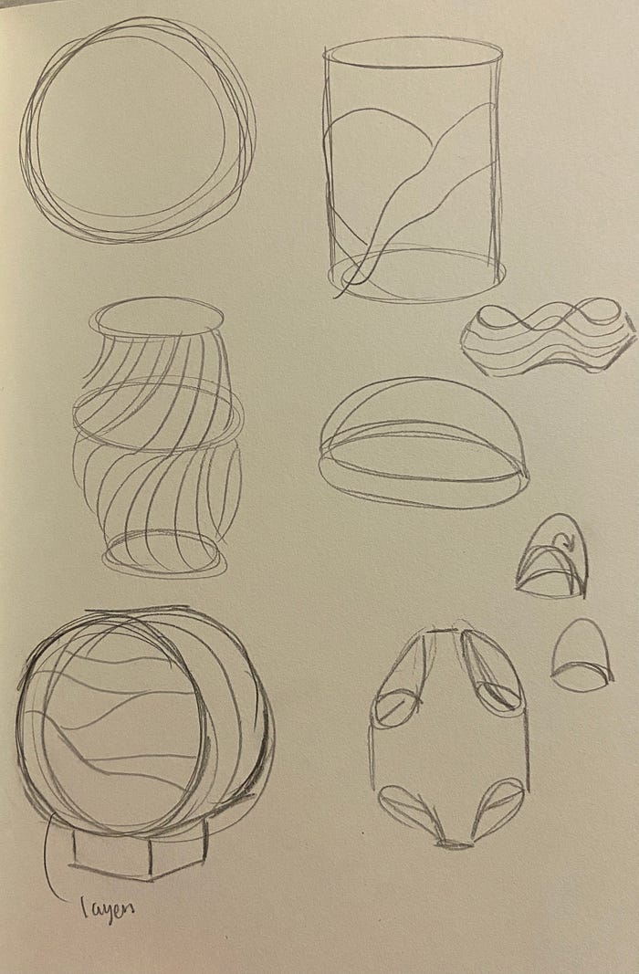
I found that sketching lamp figures is difficult since a lot of the details are largely dependent on the physics of the paper itself. I tried not to make the material do things it would not do in the drawings by only sketching a vague idea of the model on paper and then translating that into sketch models to carry out my usual “sketches.”
Studying the behavior of paper was my next step. I tried to create many different structures just by twisting the paper a number of times to see what that would result in. By doing this, I learned about the limitations that paper has when it comes to turning and curving.
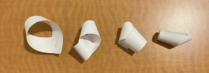
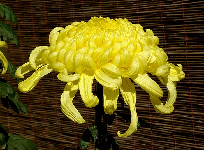
The first twist I created reminded me of Chinese Chrysanthemums, and so I decided to make a flower like lamp.


The end product of this iteration reminds me more of a present bow than a flower, but I think a bow would also be ok to relate relaxing to. I created this by doing several of the singular twist I showed above. The major downfall of this lamp is that the bulb is exposed on the side, which is too harsh for a relaxing space.
So, I tried to block more of the bulb with my next iteration. This time I tried to mimic a traditional lamp lantern cover by including strips of material that block the light.


This was made with printer paper, so it was more flimsy than I wanted it to be. Since the form is not well supported, the paper would shift around. I wanted to see the full capabilities of this design before moving forward, so I recreated it with a thicker stock.


This is the iteration with a thicker stock, but it seems to contain the same problems as the previous iteration. The bulb is still exposed (perhaps even more so now) while achieving a less aesthetic look.
Somehow coming up with designs for this project is a lot harder than the carrier project since there are a lot of lamp forms on the market, and we have more freedom.
Moving forward:
- Cover the bulb!!
- Experiment with curvatures within a compact form (so stay away from paper ribboning)
- Explore differing approaches rather than focusing on one method.
Changing path
November 18, 2020
Feedback from Steve and Stacie:
- Think about appropriate size (big? medium? small?)
- The effect of the lighting engine on mood (dynamic movement -> energy, less movement -> relaxing)
- Consider the placement of the lamp (hanging? standing? sitting?)
- Explore more ideas!! Don’t just make variations of the same idea
- Explore backlighting — bouncing light off of a surface
After receiving feedback from Steve and Stacie about exploring ideas, I realized that I had been doing variations of the same concept during my last set of iterations. So, this time I wanted to fully experiment with various folding, pleating, pending, and curving techniques in order to understand the limitations of paper better.
During class, my breakout group noted that successful lamps created covers with layers to diffuse the harsh light of an exposed bulb. Looking back at my iterations, I realized that I have been exposing the bulb too much, which lead to having light that is almost blinding. Something that causes discomfort, like having a very bright light shown in your face, is not ideal for the goal of personal relaxation.
Although I need to figure out a way to cover the full bulb, I didn’t want this to limit my exploration of paper, so I decided to create guidelines of characteristics that I would try to conform to but not strictly follow. I then made a series of questions to analyze some of the curiosities I had.
Criteria/Characteristics:
- somewhat organic in nature- either through roundness or through representation
- cover the whole bulb to soften harsh light
- siting on a flat surface rather than hanging
- in the range of small to medium sized
Here are my explorations:


When I started exploring, I began with a few half-baked ideas. These were more doing than thinking, which was a nice change of pace. These broadened my understanding of how paper behaves and also started turning the gears in my brain to envision other designs.


For this exploration, I decided to take the “organic” aspect quite literally. When I was sketching lamp ideas, I thought of creating a lamp that utilized leaf like forms to encase the bulb. This action of wrapping leaves reminded me of a Chinese dish called zongzi, which is composed of a rice ball with leaves surrounding it. I liked that the form was reminiscent of a food that reminded me of home.
However, creating a curved leaf form was challenging. I could create strips of paper in a leaf shape, but trying to curve the paper plane would have limitations.

So, I tried to create an inner portion that allowed for the paper to mimic the shape of a leaf better.
But the only problem with this is that the shape would not be very flexible, and also the paper did not enjoy being in this position. Bending it required me to put a lot of tape, and even then it would pop back to its original form.
Moving on from this idea, I tried to create a flower reminiscent form by creating slots in paper and joining them together in a conical shape.


After sketching this design and creating a quick mock-up, I decided that I did not want to further explore this route. The resulting figure seemed too inorganic and not very flower like.
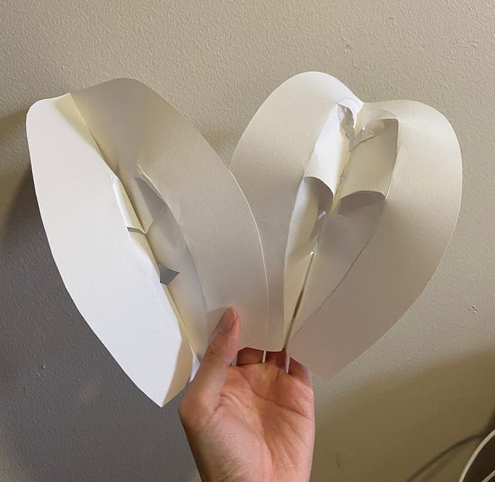
So then I moved onto creating waves. Waves remind me of the sounds of the ocean, and I wanted to somehow recreate that in the lamp. I thought about having more dynamic expression of waves by creating an almost pop-up style paper cutting.


This approach has the same shortcomings as the flower form in that they both feel too inorganic. I had originally thought of creating a box with these wave forms on top and allowing them to move up and down using springs, but I think that the basis of the idea, the waves, had major flaws. In my opinion, the waves are not very aesthetically pleasing, and I think that the number of cuts into the form creates too much complexity for the given purpose.
Next, I tried to imagine waves in a smoother sense, by not cutting up paper and allowing the paper to create curves of its own.
When looking at relaxing lamps, I saw a lot of reoccurring themes with recreating existing forms. I noticed that a lot of the lamps took direct inspiration from things that are relaxing in the real world.


Here is the next iteration:


This piece translate “wave” in a literal sense. I wanted to communicate something soothing without having it be too cluttered. However, I think that the wave is too simple since it is just a smooth surface, and there isn’t a lot of visual interest. When creating it, I struggled with connecting the curved paper piece to the flat side with tape or glue, so I decided to try out sewing. The process of sewing was time consuming, but it allowed me to cleanly attach the pieces.
The main problem with this design is that it seems too simple, and I’m not sure if that is a good or bad thing. Since the lamp is aimed for relaxation, a simpler form would be idea; however, I’m not sure how simple is too simple. This balancing act has been a major obstacle for me. Hopefully, during our next class, I will get more feedback on this issue.
Moving forward:
- How can I create rounded structures?
- How can I cover the entire bulb while still retaining dynamic elements?
- Would a simplistic design benefit a relaxing space since it draws less attention and allows inner focus?
Prototyping
November 24, 2020
Personal feedback from Steve and Stacie:
- don’t be literal about water, create forms that suggest the movement of water rather than the physical representation of it.
- look at forms that are not closed
- take inspiration from lamps within the relaxation group that represent waves (specifically John and Renee)
Before starting my sketches of the next iteration, I looked at different moment-in-time interpretations of water (so visualizing water in a still form). I find that water is very hard to translate into a still form due to the way we interact with water in real life. Water is always moving and flowing, so making a static object feel like water is a challenge.
Here are some photos of water interpreted through static materials:


I noticed that I enjoyed the water translations in fashion since it utilized layers to communicate the movement of waves. I wanted to somehow replicate the layering effect in the next iteration of my light engine.
Here was my process:


I created panels of rounded figures using a thicker paper as a stencil and then traced the form onto another piece of cardstock. Then I cut the stencil to repeat this process with a smaller panel. The smaller panel needed to be cohesive with the larger rounded figure underneath, so cutting out the stencils from a singular plane made the most sense.
I then stapled the different layers together to make something similar to the dress with rounded edges in my inspiration photos, and I used double-sided tape to make the flat layers become three-dimensional.
The new iteration:


View of the iteration with the light off:


I made the light engine more of a lamp shade with a portion that anchored the lightbulb. Considering the working process of adding the curved pieces, making the anchored lightbulb portion connect to the larger lamp shade piece did not make sense. Moving the shade around and having the freedom to manipulate it without worrying about a structured bottom was something essential to this iteration.


I noticed that the paper I used gives off a pink hue, which makes it feel less like waves and more like some sort of plant like figure. I think this reminds me of a strangely warped flower.
This iteration has a lot of flaws. Some of the things I am unhappy about are:
- the figure is too dynamic, there are a lot of moving parts
- it is not symmetrical, so looking at it in different views drastically changes the form
- there is a band of overlapping paper on the base cylindrical form
- starting point of the layers (where the staples are) is visible when the lamp is turned on
In addition to this iteration having many issues, I am not exactly happy with the overall design. I feel like it is not what I would imagine when thinking of a relaxing lamp (I don’t feel relaxed when looking at it), and I’m not exactly sure how I would transform it into a more suitable light engine. I think I will continue to explore other designs along with attempting to refine this one.
Moving forward:
- How to make a simple but interesting form
- Can I translate water less dynamically and more soothingly
- How can I emit relaxation from my lamp (yes, a fundamental question that is basically the whole project but is something I still am struggling with)
Starting Over
November 30, 2020
Feedback from peer review:
- Organic shape
- overlapping band is distracting
- modern shape — no clear link to real world thing
- too dynamic for relaxation
This was my reaction to the peer review:
I agree with the comments about it being too busy for it to be relaxing. I think that I will try to tone down the amount of separate pieces I utilize to make it less complex. Perhaps only use larger teardrop pieces instead of the multiple smaller sections. For the next iteration, I will definitely work on the cylinder connection to make it less obvious. I think that I can achieve this by altering the way the base cylinder’s form or by covering it up with the teardrop pieces.
Tending to the comment I made during the peer review session, I sketched out a few ideas of the pattern with fewer moving pieces.


Here, I tried to keep the pattern of sweeping teardrop shapes consistent by recreating the general movement but limiting it to fewer pieces. I decided on three large pieces and created a prototype from this design.


I felt like this model emphasized the flaws of the previous iteration. My qualms with the previous model were that it was not symmetrical enough, which caused dynamic movement. Also, the way it is not symmetrical is not aesthetically pleasing to look at. From some angles it is ok, but rotating it causes the lamp to look very different (and also ugly).
I decided to take another approach by attempting to make the form more symmetrical, but have it still be organic in nature.


I struggled with creating a symmetrical design that would still allow for organic movement. I thought of doing an S shaped curve throughout the lamp shade, but having the layers on the S shapes looked strange.
So, I tried another approach. I decided to isolate the pattern into only specific shapes on the lamp.


I initially thought of sectioning the lamp into three rows and then having the teardrops be partitioned into those rows; however, when I thought about it, I could only envision it looking strange. I did not feel that the geometric dividing helped the lamp feel more organic.
Then I moved on to an altered teardrop from where both ends were large and rounded with the middle being thinner. This shape allowed for more flexibility since it was symmetrical and would look good on both sides. I was still stuck on which pattern to go for since patterns on a 2D plane would look differently on the 3D cylindrical form.


I decided that the pattern on the right suited the purpose more and was less cluttered, so I started making a prototype for it.


I thought that the side that looked almost like a yin yang was pleasing to look at, but then the other angle was not. Again, the problem of different angles looking bad haunted me. I was getting more and more frustrated with this path, so I decided to scrap it and try to create a new design.
Here are my sketches for a new design:


Here, I tried to create an interactive design where the user could move a tab that was attached to a curtain like form to dim the light. I liked this idea, but it was very complicated and would take a lot of time to prototype and iterate into a working finished product, so I opted for putting this on the back burner and creating new sketches.
Here are my other sketches:


This time, I went back to the initial idea of having a flower inspired lamp. I think that the nature of these extending pieces makes the lamp look more polished and cohesive. Since the petals are vertical and not horizontal, it will look the same on all sides, thus preventing any ugly angles.

For this model, I cut out separate petals and then attached them to a base ring.


This form was definitely more symmetrical than the previous iterations, which I appreciated. It also was less dynamic compared to the wave/teardrop lamps.
I enjoyed the overall concept and structure of this iteration, but I felt like it was still too complicated. I wanted to slim down the number of petals I used to create a more simple composition.
So, I went back to the drawing board to alter the design.

This time I wanted to connect the petal forms together instead of having each petal be a separate piece. This would help with keeping the form consistent and also would make creating the model less tedious. I altered the design to consist of three pieces that attached to the base.


The cylindrical base is layered twice to both prevent more light from coming out and to prevent a harsh band where the form is connected.


When making the separated petal bands, I did not account for the thickens of the paper altering the positions of the petals. In the photo on the left, there is a gap between the petals when it is supposed to be flush. Also, I attached the petal pieces using clear tape, but it is still visible from the side.
I plan on adjusting the lengths of the petals and also use double sided tape for my next model.


I was happy that the design was more simple compared to the first iteration, but I felt as if the design was too simple. I then had the idea to incorporate the layering effect of the wave model into this one but only for the inside.
The model felt too hollow since the petals that extended from the form caused big gaps. I then filled the gaps using layers.


With the added petals in the center, the light engine feels much more complete and whole.
I think that in this version, it resembles a flower less. I feel like it almost looks like a candle or a flame, but I don’t see that as a bad thing.
Things I need to work on for the next model:
- experiment with the base
- ensure that the lightbulb is situated further down the lamp
- create a cover for the top
- make the petals and the center piece feel less disjoint
Now that I have settled on a general path that I am happy with, I can start refining the model! I have been struggling to find a path that I wanted to go down, so i returned to my initial idea of a flower like form. I think that throughout my exploration with the wave model, I have been trying to force something I was not enjoying, and returning back to what I initially wanted to do was a good change.
However, I don’t regret the wave model since it allowed me to think of using layers for the flower model. I think that loosing my direction and feeling lost caused me to branch out and try a lot of different things, which helped me when refining my final design.
Moving forward:
- What kinds of bases are appropriate for this model?
- How can I cover the top while still being consistent with the form?
Final design
December 2, 2020
Feedback from Steve and Stacie:
- the base and the body should feel cohesive
- should have no exposed bulb
Feedback from Nick and Alice:
- the cylinder feels like its erupting from the petals — alter scale (make cylinder smaller or petals larger)
- explore a solid base (think of a salt rock lamp… would you like that on stilts?)
The end of this project is among us! To prepare refining my lamp, I decided to jot down what things I needed to alter from the previous iteration.
Here is the list:
- cover the top of the lamp to prevent an exposed bulb
- design a new base
- alter the scale by making the lamp bigger
- adjust the “erupting” center issue
Scale
I started off my refining process by altering the scale of the lamp. Previously, I had made the lamp out of a 9 by 18 inch cardstock; however, the feedback I received and my observations led me to recreate it on a larger scale. This time I used a 11x24 inch sized paper. I adjusted the measurements of the petals accordingly.
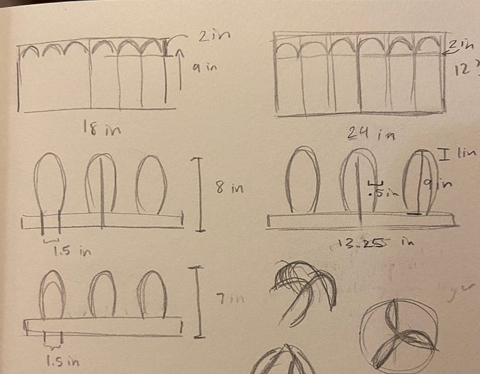
I ran into a little bit of trouble with this larger scale since I did not own a piece of paper that was 24 inches long. I settled by using two 18 inch sheets and taping them together.

This was quite ugly since it was in the center of the petal and would not be covered. The simple solution to this was to move the cut to an area that would be covered by the petals.
Erupting center
I then tackled the “erupting center” issue by altering some more measurements. I made the curved portion of the cylinder slightly shorter (from 3 inches to 2 inches) and made sure to attach the outer petals higher up on the cylinder base. This way, the center felt more engrained into the form and had less of a erupting feeling.
Top cover
Now, come the real challenges. I wanted to cover the top of the lamp to prevent someone from being blinded as they stood up and looked at the lamp. This was quite challenging since I still wanted the cover to be in theme with the rest of the light engine. Putting a flat circle into the center would NOT be ideal.
To stay with the flower theme, I made a cover that mimicked a rose bud.
This cover was simple to make and was relatively aesthetic. However, there were some issues.


This cover added more complexity to the form, which is something that I am wary of. I did not want to create more areas of interest since having too many focus points would draw too much attention. Since the layered outer petals are already attention grabbing, I think the addition of the top would be too much.
Also, the cover had a harsh edge that would show up clearly when the lamp was turned on. This was distracting and not pleasing to see. I then thought of ways to mitigate this harsh edge.
I then realized that I had an inner layer to the cylindrical base that I could utilize! The inner layer’s function was to prevent a harsh band from being seen when the cylinder connects, so I could manipulate the top portion of that layer as I pleased.


I thought that I could extend the existing curvature and then overlap them. However, this made the cylindrical form very warped, and it was not very clean. I also thought that the shape it created was not as reminiscent of flowers.
So, I moved on to another version.


This cover is similar in structure to the previous version, but it took on the rose bud look. This was also pretty hard to construct cleanly. I wanted something that would be easier to assemble since when it would be attached to the large cylinder then I would have limited flexibility and movement to create the cover.
So, I created another version.


This version of the rose bud utilizes three pieces, which would theoretically be extending from the inner cylindrical layer. This one checked off a few boxes; it would be attached to the inner layer thus preventing a harsh line, and it would be easier to assemble. However, the same problem of complexity occurs with this version as the first one.
Then I took a look at the existing lamp iteration and realized that I could just move the inner layer together to create a partial cover.

This version was simple, easy to assemble, and did not create a harsh edge. I would alter it a bit to close the gap a bit more, but this concept became the cover for the final version.
The base
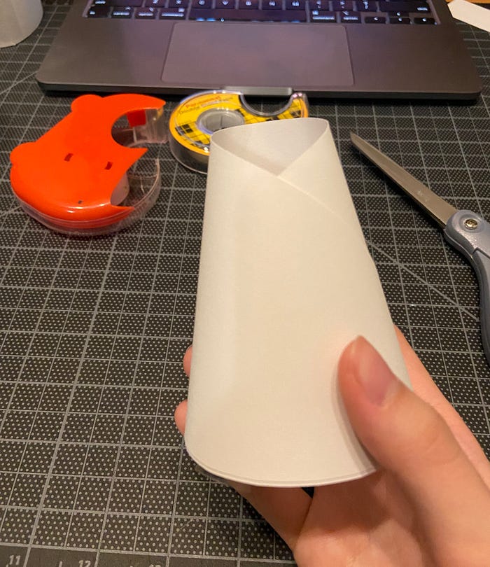
The new base would have to feel more static, solid, and unmoving compared to the other one. I thought of a pretty simple solution to this: use the band that connects the petals.


The old base was basically just a contraption that held the lightbulb up. I decided to recreate this contraption but make it smaller.

This new base fits snuggly into the lamp shade and is fully covered by it. I then just cut a square into the lamp band to allow the wire to extend from it.
And finally, I had the finished product:


Overall, I really struggled with this particular project. I think that the main reason for this struggle was that I was trying to do too much at once and then becoming paralyzed by all the possibilities. Since we got a lot more freedom for this project, I wanted to do so many things at once, yet I ended up failing to do any of them.
The turning point happened when I decided on a path I was confident with. This brought me back to designing with some sort of vision of the end product. For the wave models, I could not envision where it would take me, and thus I was utterly lost. After striving for a flower inspired lamp, I was able to create something that I am happy with.
