Nobel Typeface: Spread
Exploring the characteristics and personality of Nobel through a spread.
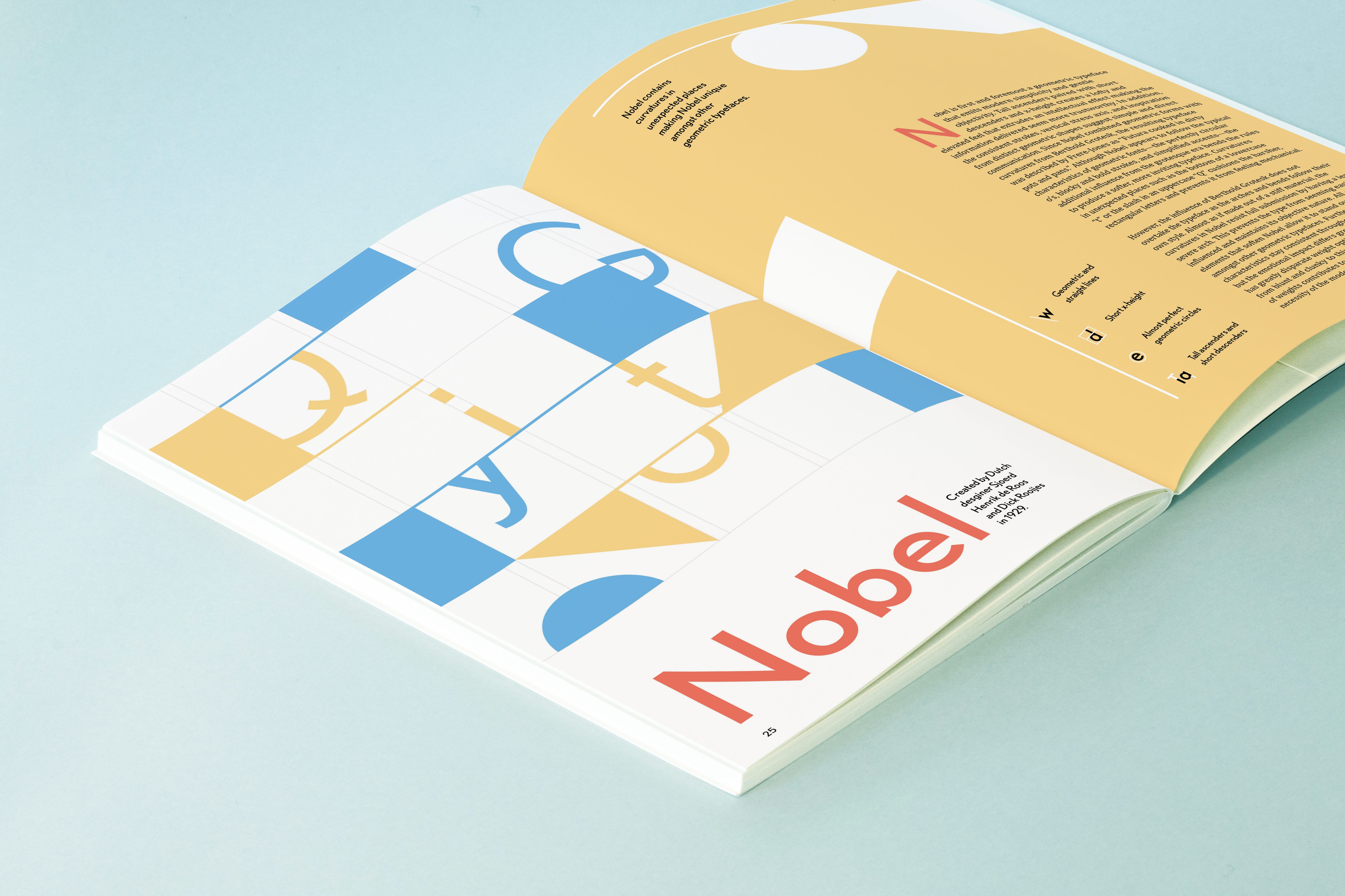
This project utilizes hierarchy, placement, and color to create a spread that explores the characteristics, personality, rhythm, and flow of the Nobel Typeface.
Research and Writing
—September 23, 2021—
Nobel was created in 1929 during the geometric sans-serif era by Dutch designers Sjoerd Henrik de Roos and Dick Dooijes and became a popular printing font in the Netherlands. Typefaces during this era commonly drew inspiration from geometric forms such as circles, squares, and triangles — and incorporated even stroke weights which resulted in a modern and clean look.
Nobel was specifically designed to compete with Futura, another popular geometric typeface from a rival type foundry. However, the development of Nobel began with a license to an existing grotesque typeface, Berthold Grotesk.
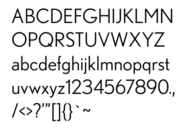
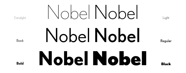
The Nobel typeface would later be converted into digital type collections twice in 1993. First, it was revived into DTL Nobel by Andrea Fuchs and Fred Smeijers of the Dutch Type Library, and it was revived again by Tobias Frere-Jones, an American designer at Font Bureau. After Nobel was revived, Cyrus Highsmith and Dyana Weissman added lighter weights for a total of six different stroke weights in the Nobel font family.
Characteristics
The overall look and feel of the typeface is:
- Low x-height to cap height ratio (short x-height with tall cap height)
- Short descenders and tall ascenders
- Double stack lowercase “a”
- Vertical stress axis
- Generally consistent stroke width (low contrast)
- Narrow/normal width letters
- Narrow tracking
- Letters follow either circle, triangle, or square shape
- Some curved accents
Nobel is unique in that it follows a geometric sans-serif style, but it breaks the rules in many places. Geometric sans-serifs are generally characterized by perfectly rounded o’s and pointy capital N’s. Nobel does follow the perfectly circular o’s, but some letters like G and e stray away from the mold (upper right and middle left).

However, even though Nobel maintains the triangle inspired pointedness for lowercase letters (lower right), this is lost in the uppercase letters (upper left). The N,V, and W all do not have a pointed tip.
Another discrepancy between Nobel and traditional geometric sans-serifs is that Nobel puts in curves in unexpected places (lower left). All of these characters except t have a curving element which is expected, but in some geometric sans-serif fonts these curves are removed to align with the straight and modern style. In Nobel, not only are all the curves present but there is an additional curve in the t that is not necessary.
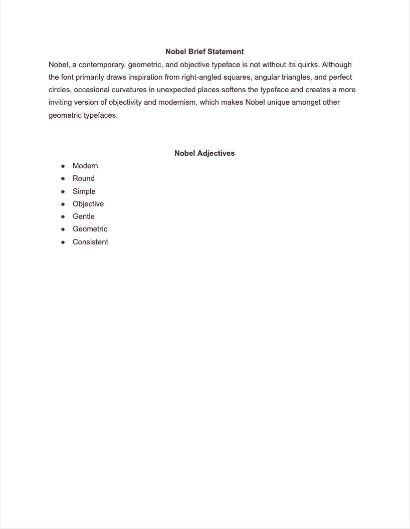
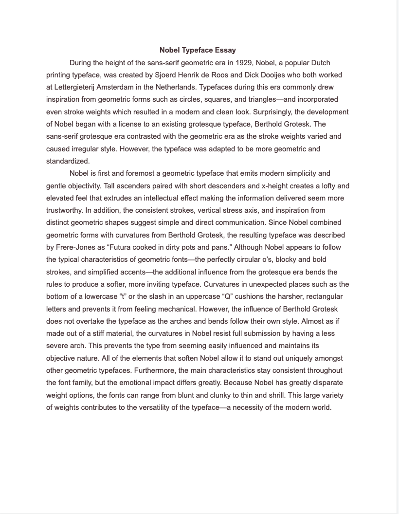
Adjectives, Brief Statement, and Essay:
Type and Thumbnail Experiments
—September 28, 2021—
Fonts
Because Nobel is a relatively simple sans-serif font, the readability is ok for body text; however, due to the short x-height, Nobel would not be my first choice. I decided to find a serif or sans-serif font that paired well with Nobel to use for my body text.
I printed out a sheet of various fonts along with Nobel to see which clashed and which had the most compatibility. Because Nobel is already a sans-serif font and is relatively simple, the sans-serif fonts I found were either not distinct enough or were too distinct and distracting. On the other hand, serif fonts were distinct enough because of the serifs), and I could find one that matched the energy of Nobel. In the end, I decided to go with Cambria.


With my chosen body copy font, I printed out several versions to test font-size readability. Initially, 12/14 seemed like a good size on screen; however, this was too large when printed, and the best body copy font size for Cambria was 9/12.
Column Structure
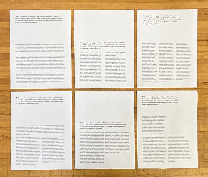
By printing out the pages, I was able to understand the readability of differing column structures. On the screen, the readability of varying sizes of fonts and columns is masked behind the ability to zoom in and out as well as a lack of accurate scale. However, the differences in readability is obvious when printed.
- One column structure as well as a small type size increases fatigue as a reader must travel far to find the next new line
- A three column structure has too much eye movement as each line is divided into chunk that are too small
- Two column structure seems to be the best middle ground. The number of characters is around 60 per line.
Placement
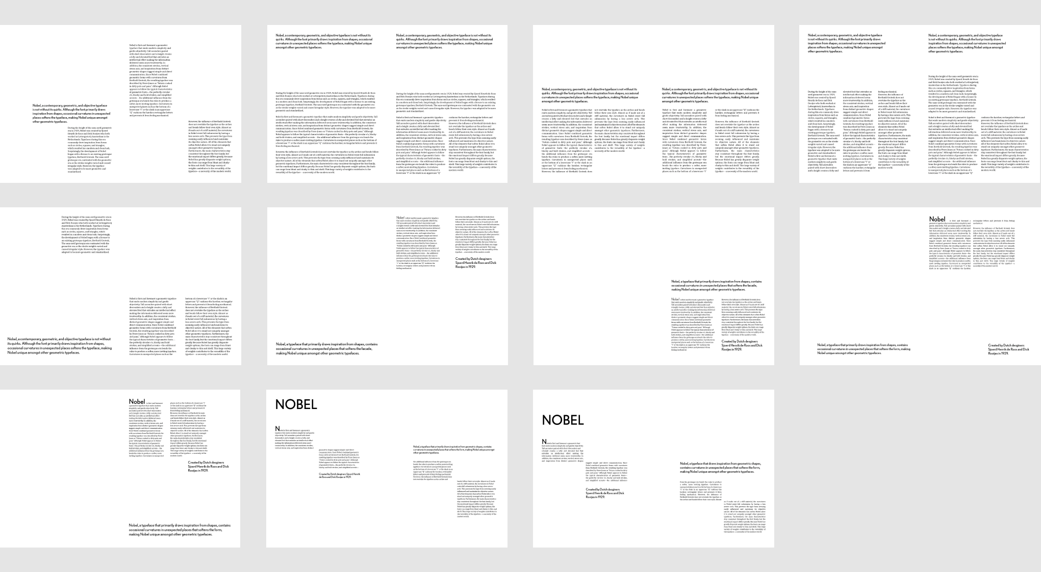
From these experiments, I found that I enjoyed breaking up long paragraphs of text into smaller chunks for visual appeal. Since the type is so long, making it compact into one area makes it feel even longer. I enjoyed the last to experiments in which I broke two paragraphs into four so that the text felt more digestible. However, I think this way of presenting the content may make the story disjoint as the reader would have to jump to multiple chunks of text on the page.
Thumbnails
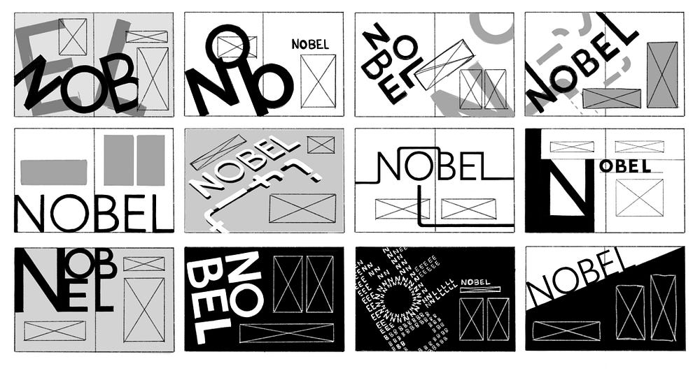
As I developed ideas for the layout to display the typeface, I wanted to try and use the type as a graphic to draw visual interest. This process was quite difficult as Nobel is a simple and geometric typeface and the graphics and layout should reflect its characteristics. Nobel also has some curvatures that add a humanistic style to it, and I somehow had to balance featuring this while staying true to the predominantly geometric nature of Nobel.
Feedback on thumbnails:
- They like posters rather than a spread; try to be more informative by incorporating demonstrative characteristics of the typeface as graphics
- Images that cross over pages is problematic in book form because it gets swallowed up by the binding
- Don’t jumble up the type—not characteristic of Nobel
Final Draft
— September 30, 2021 —
Taking into account feedback from the last class, I decided to further my explorations beyond the ideas I created in the thumbnails. I recreated a few of the thumbnail ideas in InDesign, but ultimately agreed that those spreads felt more like magazine features or posters rather than informative spreads.
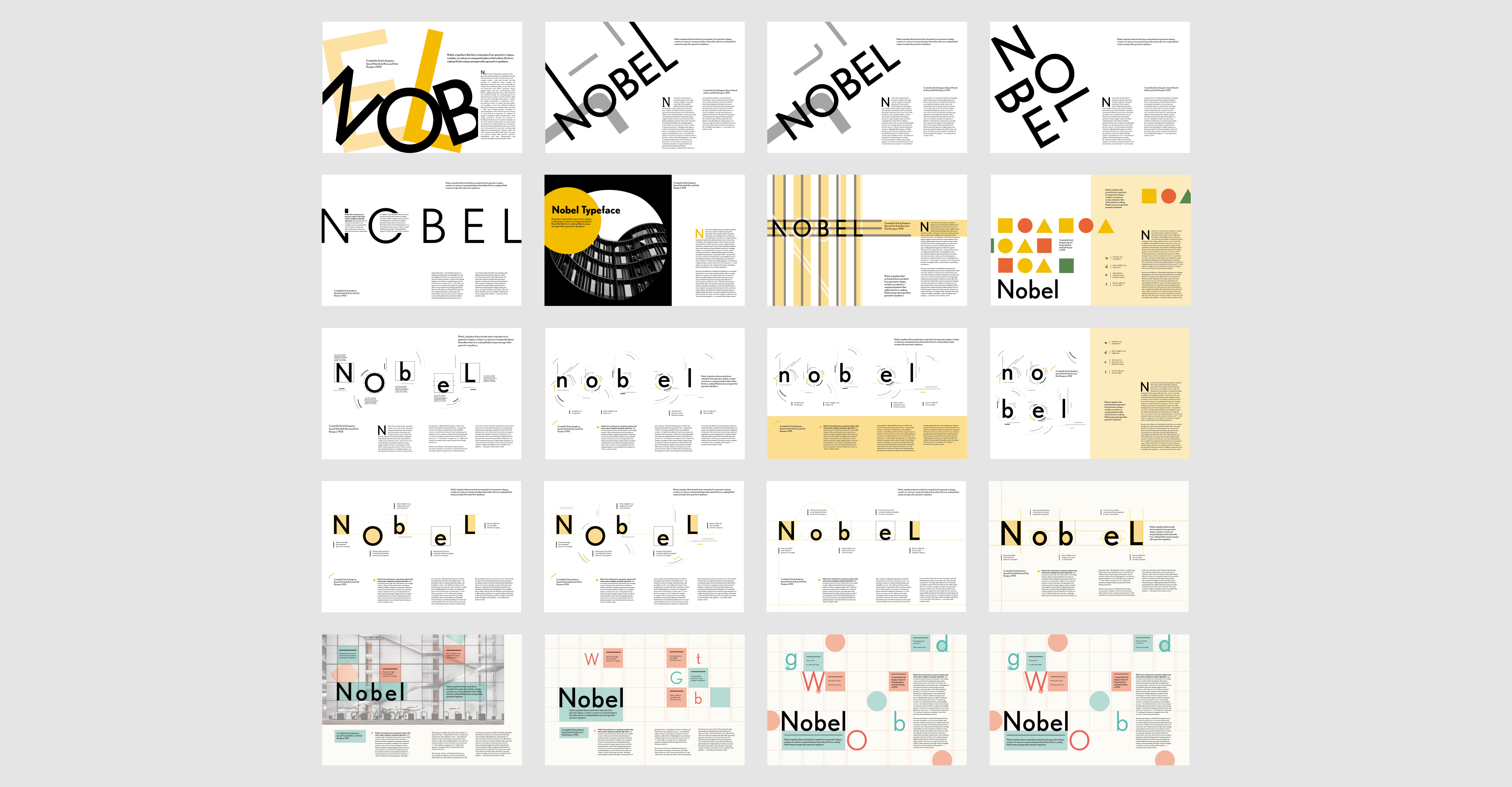
The most successful spreads were simple in approach and used graphical elements to enhance the communication of the typeface. Although some graphical elements (like curving lines in the second row) added visual interest, they did not aid in communication.
Draft candidates

For the spread on the left, adding a grid to the spread demonstrated the geometric and organized nature of Nobel, and the color pallet of muted red and blue/green made the spread feel analog. However, the blocked out sections of color are sporadically thrown across the spread which makes it feel messy and not visually appealing.
The spread on the right shows the anatomy of the typeface and does so in a simple way, but it is not unique to Nobel. Almost any typeface could be placed in the spread and get away with it due to the simplicity of the concept. Because of this weakness, I decided to go with the spread on the left.
Feedback on spread (left):
- Elements on the page (the title, the additional letters, and callout text in colored blocks) are all of similar size and hierarchical weight. They all jump out equally, which prevents a proper flow throughout the page.
- Body text is read last after all the other elements rather than after the title.
- Elements on the page don’t lead the eye throughout the spread (try using a leading path)
- Some people noted that they were drawn to the red “W” on the page first rather than the title “Nobel.”
- The colors of red and green clash and compete for attention
- Spacing of callout type is kind of strange but may draw interest
- Add page numbers and subject (personal note)
Alterations to the spread
Taking the feedback into account, I tried to enhance hierarchy of the elements on the page by reducing the size of certain things or blocking out the text so it stands out more. However, due to the grid, I was not able to fully customize the sizings of each element and was left with similar hierarchy issues as before. Then I moved onto changing the color scheme of the spreads by adding a pop of color so that the title and the text would stand out; however, I felt that the two-toned color schemes washed out the spread.

None of these spreads were successful, and I felt that I was running into a dead end, so I decided to go back to my initial spread explorations.
This geometric spread idea was initially scrapped because I thought the idea was overdone, but in hind sight, Nobel is a very simple and geometric typeface so it made sense that I kept returning to the square, circle, and triangle motifs.

After changing the color scheme and refining details, I finalized the geometric idea with the spread on the right.
Then, I decided to draw inspiration from my Nobel animation video. In one of the scenes, large letter forms are organized on the screen with some coming off the page.
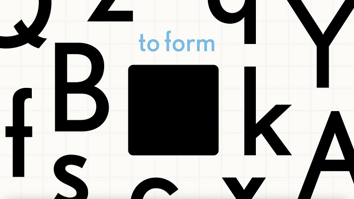
To transform this into a spread, I reduced the contrast of the letters and played with adding geometric shapes to the arrangement of letterforms.

Comparing the spreads
Both spreads have pros and cons in terms of design, so I carefully weighed them by asking for others feedback.

The letter form spread (on the right) partially covers the letters, which may be problematic as it obscures the figure. Also, the large letters may draw attention away from the text; however, I think that it looks more visually interesting and may intrigue readers to stay on the page and start reading the text. On the other hand, the geometric shapes spread (on the left) is simple and doesn’t compete with the text, but it has less visual intrigue.
Ultimately, I decided that the spread on the left brought more to the table as it was more bold and eye catching.
Final Spread

Reflection
Creating this spread was an exercise in not only type and placement, but also it taught me about branding. Not branding in a sense of creating a new identity from scratch but working with an already existent entity and ensuring that the spread conveys the correct characteristics. Because my typeface is simple and orderly, I had a difficult time understanding what kinds of graphics could compliment it. After multiple iterations and going back to my initial ideas, I was able to narrow down and refine the identity that I wanted to portray for Nobel.


