Spatial Experiences
Bringing human experience into a space

February 2, 2021
Easing into the mindset of envisioning experiences as 3D places, I started off with an exercise of representing a space in concrete form, abstract form, and 3D abstraction.


This exercise opened up my perception of a space in terms of feeling and contextualizing that feeling into something concrete.
Then I moved on to looking at repetitive, simple modules that, when combined, would become a form greater than its parts. The modules essentially become bricks in the greater scheme of things; however, the module plays an important role as a building block with the ability to scale.
Prompt: Design 3 different modules, each approx 1 in x 1 in, and make 10–15 of each of them. Then make two 3D structures using only one module per structure.
I started to think of ways I could create simple forms that could connect to create a complex figure.
I initially started to sketch ideas, but it felt like sketching was not productive since most of my work would lie in fiddling with the real deal, so I dived into sketch modeling.
Module 1:


This module is a simple oval shape with diagonal slits and a crease in the middle.


Here are some modules I created with the module. I decided to conjoin the pieces in an alternating pattern for the first model, where the crease would be horizontal, vertical, horizontal, etc. For the second model, I did not alternate the crease and chose all vertical creases. This one was able to curve into a rounded figure, which was able to flex inwards and outwards.
Module 2:

This base form was very simple. It is a square with vertical and horizontal slits in it.


Here are the models I created with module 2.
For the first model, I went with a more spread out approach; however, the model was not very stable since most of the connections between the pieces were limited to just one connection.
The second approach was more stable since there was a flat base and many more connections between modules.
Module 3:

This is a leaf shaped module with three alternating slits. The three slits in different directions made creating a larger form easier.


Here are the models. One of them is an accordion style model and the other is a semi rounded figure. The accordion style model was able to be compressed.


Takeaways for next time:
- Scoring that created bending allowed flexibility, which allows for curvature
- Adding more slits amplifies complexity in connected form
- Make form less inorganic and repetitive to add interest
Adding the human experience
February 8, 2021
Prompt: Develop up to 3 modules for one structure that are 2 in x 2 in and make a minimum of 20 individual modules. Then choose a verb to derive the form of 1 occupiable space.
Building on from last class, I kept in mind the points I learned when I sketched. Since this form is centered around a verb, I started to brainstorm different actions that I could explore.


I wanted to create a form that catered to a more personal experience, so verbs like sleeping, thinking, waiting, and eating drew my attention. Although these spaces are “personal” I wanted there to be an aspect of community, so most of my drafts are a collection of these personal spaces.
I started creating modules that had the potential to create what I had envisioned.


This module is a rectangle with the edges cut on a diagonal and slits running parallel to one side. There is also a middle horizontal slit that I created for more versatility.
This module felt too angular to be a personal space and was also quite difficult to build upon since the slits were awkwardly placed.
I also found it imperative that a personal space, whether it be used for waiting, eating, or sleeping, had to have a covered roof. The word personal represents a safe, pleasant experience, and a sheltered structure that shields one from rain and snow is imperative for the goal I am striving towards.
Moving on, I decided to play with layering long modules together to create a flat roof like structure.


I enjoyed the direction that this was going in; however, the module had a lot of flaws, mostly due to its inability to create a stable structure. Since this module is not symmetrical, it was difficult to form “walls” of the structure. So, this module was more like just the roof part of what I wanted.
I went back to the drawing board and sketched.


I then got the idea of a train/bus station waiting area. I wanted to have the waiting area be elevated from its traditional monotony so that the people waiting would have something interesting to observe.
For the modules themselves, I looked towards roof shingles for inspiration. My home has a terra-cotta roof that consists of a curved module like piece that fits like a puzzle together to create the roof. Although the pieces are curved, they are strong enough in structure and design that they can come together to form a single sheet that protects my home.

These tiles gave me ideas of forming my next iteration.


I went with the simple shape of a rectangle but I created three scores in which the plane would curve. There are two different kinds of slits: the outer two are half the width of the module and the inner two are 1/4th the width of the module. The difference in slit length is to allow for the module to act in a shingle like manner and be layered on top of one another.


Color Effects
February 11, 2021
Feedback from last class:
- Play with scale
- Alter the benches to make them more integrated with the figure
I felt that the critique about scale was appropriate since in my former iterations, the place felt a bit cramped for people to enter. It also could only house a few people at a time, so changing scale would help the waiting area accommodate a larger crowd.
I also started thinking of ways to alter the benches by recreating them using the curved form that is present throughout the figure.
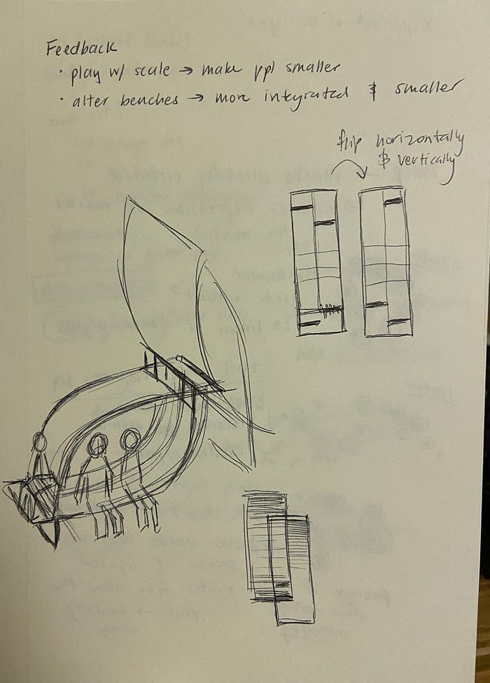
I changed the bench to be more uniform with the structure since it is curved and connects together in a similar fashion to the rest of the modules. Another critique I received was that the benches felt too bulky, so I shortened the width and length of them.

Prompt: Add some color, and take photos with the perspective of a visitor with different lighting conditions.
Playing with lighting:


Since this form is a waiting area for transportation, the form would be seen in different lighting conditions created by nature. So, blue and yellow light seemed to be most appropriate to experiment with.
Blue light made the form very harsh, especially since the insides were painted white. The place feels tense and stressed, which might be suiting since airports and train stations are fast paced.
Yellow light softened and created a more welcoming experience. This gives off a more relaxed and slow atmosphere.
Neutral light seems to be in the middle of blue and yellow light in terms of aura.
Playing with colors


I digitally altered some photos to help me decide my colors. I felt that the black was too intense, and I kept associating the salmon and white color combination with Pokemon, so I decided to scrap both.
I knew that I wanted to paint the interior white since the area is susceptible to dark shadow, and a lighter color like white would help brighten up the space. Having dark colors present in the interior makes the space feel dreary and less active.
I ended up going with the natural cover finish for the exterior and a patterned underside. The underside gives people something to look at while they wait.

The goal of this pattern was to make the space feel less tense. As people wait here, they will have something to gaze upon!
Waiting can be a frustrating and anxiety producing process, but the space will hopefully assuage these emotions.


Since my figure looked intimidating, I thought that adding a playful pattern to the inside would help ease this intimidating feel. I have mixed feelings about the pattern since doesn’t seem to suit the atmosphere, but I’m worried that committing to a more formal coloration would make the figure too unwelcoming.
My biggest question for coloration is should I be making the place feel more comfortable and contrast with the space or should I aim to be as consistent to the form as possible.

Here are some color alterations with the patterned underside.
Perspective of a person walking into the space:

Moving forward:
- Determine which “vibe” I should go for
- Does the paint job have to be consistent with the form?
In Context
February 16, 2021
Feedback:
- The inside of the space does not have to have the same feeling as the exterior (consistent with the form vs. creating a different atmosphere issue from my last update)
- Think about the context that the form is in. Will it be indoors or outdoors? How will the colors or patterns look in either environment?
- Specify where the structure is located further
Overall, the feedback showed me that the structure was accomplishing what I wanted it to accomplish. I strived to create a welcoming and calming space that would dispel negative emotions associated with waiting, and Professor Q agreed that the space achieved these goals.
What I had to work on next was imagining the structure in context. I had originally thought of this space for the outdoors, and Professor Q brought to my attention that the color scheme I used might clash with colors of nature.
I then set out to find colors that worked in harmony with nature, so I turned to researching park structures.


I first looked at playground color schemes since they were very bright yet still meshed well with the colors of nature. However, since my structure is stand alone and will not have supporting items with similar colors surrounding it, the principles of playground colors would not apply. These colors make the structures the focal point of the space, which is too grand for a waiting area that is supposed to support an environment.


Then I looked at structures that harmonized with its surroundings. I noticed that most of the colors are muted, and they are centered around more natural colors such as browns and grays.
After discovering the trend of browns and grays in park structures, I painted the exterior of a few sample modules.


I tested out a lighter, orange brown, a dark, gray brown, gray, and black. I decided that the gray brown would look best since it is not too distracting and not too industrial.
The next step was determining the interior colors.

Since I wanted the space to be calming, I was wary of the red and brown combination and leaned towards the green version more.
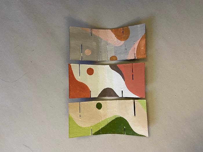


I changed the white background to an off-white to reduce the contrast.
The green and beige color scheme gave off a feeling of warmth and comfort, so I decided to paint my structure with this scheme. The other two were more cold, which is not what I wanted to represent.


Here is a image of the structure in context.

Here is the intended visitor experience:
A tired, weary traveler takes a rest at an interesting structure to await their bus. They just had a long day and are impatient to go home. Seconds stretch into minutes and minutes seemingly into hours as they wait. Then, they glance up from their phone and see interesting patterns on the curved walls inviting them to come explore. As they trace the painted designs, they venture throughout the structure, and sooner than expected, the sound of the bus coming to a screeching stop alerts them that it is time to go. The visitor parts from the structure with a mind clear of frustration, and pleasantly seeks out their next destination.
Relaxing, interesting, natural
Here is the visitor experiences I got from friends and family:


Nathan:
- Feels like a forest or canopy
- Makes you feel small
Michelle:
- sheltered
- comforting
- relaxing
Emily:
- Would like to climb it
- In awe of the curves
- Colors reminded her of nature
- Could see it in a city scape environment or park
Mi:
- Want to explore, climb into the crevasses and study the light patterns
- Curves and colors remind her of a tree
- Imagines it is a resting place at a park
All of them touched upon elements that I wanted to convey, so I was quite happy. It was interesting to hear responses from fresh eyes since working on this structure for so long has made me unsure if it is evoking the intended emotions. I will definitely incorporate asking people who are not in design what they think of my projects to get an unfiltered, unbiased response.
Final
February 17, 2021
Feedback from Q:
- Looks good, nice process
- Make figures more detailed
Q sent a link to a website called “The Noun Project” where I would be able to download free figures and icons to help with creating more detailed figures.
I found a couple figures that I liked, and I printed them out. I then glued the tiny people to chipboard and cut them out.
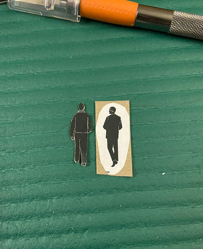
The standing figures had a small base so they could stand, and I propped up the sitting figures by adding a small piece of curved chipboard to the back.


This process was tedious since the people were so small, but I think it paid off in the end.
Here is the previous version of the tiny people and the new tiny people side by side.

The new figures are more defined, and have proportions more similar to real life people. The older models, on the other hand, break the illusion of the structure being a real place since they are stubbier and less detailed.
I also adjusted the scale by slightly enlarging the new models to better suit the structure. Previously, the models were a bit too small to realistically inhabit the space. In the photo below and to the left, you can see that the figure would have to jump up onto the seat since it is too high. In the photo to the right, you can see that the new sitting figure’s feet are able to touch the ground!


Here are the final images with the new figures!


Then, I moved onto creating renderings of my structure in context. I used the same background from before since it was a good representation of the structure being used at a park or close to nature, but I also wanted to see what it would look like in a more urban context. My friend Emily noted that she could envision the model in Tokyo on a slat, gray floor, so I tried to imitate that the best I could.


