The Pittsburgh Dance Council
An Exercise in Visual Hierarchy

Effective communication through typography relies on understanding of both the content being presented and typographic variables that deliver the message. These two main ideas will be explored through a series of posters and exercises for the Pittsburgh Dance Council’s 2021–2022 show season.
Day 1: Research and Understanding Hierarchy
—September 9, 2021—

The first step to creating a poster for the Pittsburgh Dance Council is the understand the event itself. Upon doing some research, I was able to find what information should be emphasized.
“The Pittsburgh Dance Council” is probably the most recognizable name for Pittsburgh locals as they have been putting on performances for 51 years. The dance performance names themselves are new or not extremely famous, so placing emphasis on the performer names may attract attention from those who know the artists.
Some notes of interest from my research:
- The Pittsburgh Dance Council has been putting on performances for 51 years and was an important part of revitalizing the area. They focus on contemporary dance, but also host other genres such as hip-hop or ballet.
- All performances are on different dates, spread out across 2021–2022.
- The Byham Theater seems to be pretty well known as there is no address listed on the website until you click into an event.


Experimenting with Hierarchy
For these exercises, we were limited in using certain hierarchy creating elements, such as line-weight, line-spacing, and column structure, to develop a better grasp of the effects of these changes on the page.

—Exercise 1: Font weight—
This exercise played with two different font weights. I found that having fewer, more spaced out bolded lines draws more attention to a text grouping (far left exercise).

— Exercise 2: Line spacing—
This was an exercise in line spacing. Fewer groups of multiple lines of text attracts the eye better (far left exercise) and creates a more organized look compared to several smaller lines of text spaced out across the page.

— Exercise 3: Two column structure—
This played with two columns of text. The main takeaway from this exercise was that having just one line be a “hook” into the columned information helps with grabbing the eye. Having more than one line of text makes it harder for they eye to enter.

— Exercise 4: Three column structure—
This is another column exercise, but with three columns instead of two. Having three columns seemed excessive for my text as there is not really a need to separate the the performance information further.

— Exercise 5: Line spacing and Font weight—
This combined line spacing and font weight. I think this combination emphasized the information best.

— Exercise 6: Columns and Font weight—
This was an exercise in font weight and columns. Again, three columns was too much, but two columns separated the information well. The bolded font felt redundant in combination with the columns.
DAY 2: Color and Scale
—September 9, 2021—
In order to understand the role of scale and color in hierarchy, we began to experiment with the addition of such elements into our poster. We were encouraged to not use digital programs for the start of our exploration so that we could freely make adjustments while experiencing the changes in physical form rather than on a screen.
Before selecting color pallet choices, I made a list considerations that the colors could convey to suit the event.
- Muted: Contemporary/Modern dance typically has the dancers wear muted gray or nude colors to focus attention on the meaning of the dance. Also, most of these dances have serious meaning behind them, which plays into having muted tones.
- Vibrant: Although the costume and stage colors are generally muted, the expressive dance and movement feels like vibrant colors even if they are not explicitly represented.
- Skin-toned: Because the event is centered on the expression of human form, incorporating skin-toned colors would remind the viewer of dance.
—Color Pallet Exploration—


I mixed gray or muted tones like some sort of nude or blush color to the pallets as well as a statement, vibrant color.
—Scale Exploration—
Physical explorations that were made with paper cuttings of the text. I tried to keep with margins and alignment to make the formatting look organized; however, I realized that these explorations were on the safe side.


Then, I moved these type layouts to the digital realm, and I played more with scale and movement after the class critique and seeing other people’s work.

I found that using vertical orientation hindered the readability of longer pieces of text. Sideways or angled text helped in adding movement to the type, but I was not sure it would work well with background elements that I would be adding later on.
—Color and Scale Experimentation—
Then, I moved on to exploring the role of color in hierarchy. Using tonal contrasting colors (light toned on dark toned or vise versa) for the background and colored font allows the type to stand out. In contrast, a low tonal differentiation prevents the text from being visible.

Light text color on light backgrounds as well as dark text on dark background made the type unreadable. When the color contrast was higher, the text popped more.
I got a little carried away and did some background shape exploration. However, I don’t think any of these are successful because they don’t enhance the text.

Revisiting Scale and Color
During class, I was reminded of a couple of key principles for creating compositions.
- Less is more! Use fewer changes to keep the design neat and convey the hierarchical effect
- Work with white space to group sections of information
- Make sure that the thing you make emphasized gives context for the event
- Use color to draw attention or enhance the hierarchy like using a pop of bright color
- Make sure the text color and orientation does not hinder readability
I was inspired to revisit the scale and color exercises with these key points in mind and recreate a couple of posters. My first few exercises in scale were quite safe, and I did not push the scale or movement enough, so I tried to be more bold this time around. I also focused too much on creating shapes for the color explorations, so I decided to go back and stick to the basics by just playing with font and background color.
Day 3: Adding Images
—September 14, 2021—
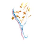
While I was finding appropriate images for my poster, I wanted to get a wide variety of representation for dance. I found images ranging from directly representational (aka people dancing) to abstracted representation.
Here are the photos I worked with:

And here are my poster iterations:

During class, we discussed ways in which the image aided or hindered the type. Most of it centered on having the image enhance the text or work in conjunction with it rather than be the focus.
Takeaways from individual critique:
—Colorful hands poster—
- Push the scale of the image, maybe have it go off the page and play with cropping
- Make some more overlaps of the hand and the type
- Change some of the spacing (distance between Pittsburgh Dance Council and 2021–2022 Season should be shorted)
- Byham Theater & trustarts.org does not seem like a group (maybe make byham smaller & reduce line height)
- Try to play with a pop of red or other color in the type
- Play with the size of the event text (go smaller) and the background color
—Other notes—
- Try to integrate image and type more so they feel more cohesive rather than separate
- Explore color pallets that match the energy from the pink and blue person poster
- Dance photograph (real people) posters are predictable, so explore the other two posters
Day 4: Refining and Finalizing
— September 16, 2021 —
The poster that excited me the most was the painted hands poster. I decided to refine this idea and explore the possibilities of the image and the type.

For some of the posters, I altered the orientation and scale of the image; however, I felt that when I enlarged the image and had it going off the page, the form was somewhat lost. Because the hands are already obscure due to them being colorful, from far away the enlarged hands look like splashes of shapes rather than an actual human form. So, I decided to stick with the centered image.
I decided that the beige and pink background suited the image the most. I felt that the pink gave warmth and an excited feel to the poster, but the beige allowed the colors of the hands and type to shine more. Initially, I decided to go with the pink version because when I put the posters on the wall, the pink was able to compete with other brightly colored posters while the beige background made it less noticeable. However, I made some alterations to the poster after the class critique.

Critique from class:
- The pink background makes the contrast between the image and the font less obvious, which hinders the attractiveness and readability.
- For aiding the poster in context of other posters and surroundings, perhaps a change in color is not the solution. Playing with scale or placement may be the solution.
- From far away, the title “Dance Council” is not standing out enough.

My main concern with the beige background was the lack of visibility in context with other posters or the walls, but classmates noted that the beige did not detract from their interest in the poster. With this, I decided to switch to the background to the beige color, which allowed the image and text to have better contrast. I also noticed that from a far distance, the type was not as visible as I would like it to be, so I enlarged the font size as well as changed the stroke weight to be thicker. Although I liked the nuance of the wide spaced letters, I noticed that this prevented the overlaying hand elements from being visible. To reintroduce this element and to aid in readability, I decided to go back to the original title style but with a bigger font size.

—Final Thoughts—
This project broke down the rules of hierarchy and allowed me to slowly digest them. I think that the exercises that limited my “tools” to create hierarchy allowed me to see what each element does on a fundamental level. After the exercises finished, I felt a little overwhelmed by the sheer number of choices I was able to make, but after becoming more familiar type weight, font size, placement, and color, I was able to trust myself in the process. One thing that stuck with me was the fact all elements of the design should enhance the text like how an image can create movement for the eye to end up at the text or how a pop of color can emphasize an important line of type. All these elements have a purpose and are used to convey a certain message to the viewer.